Yesstyle Redesign


Overview

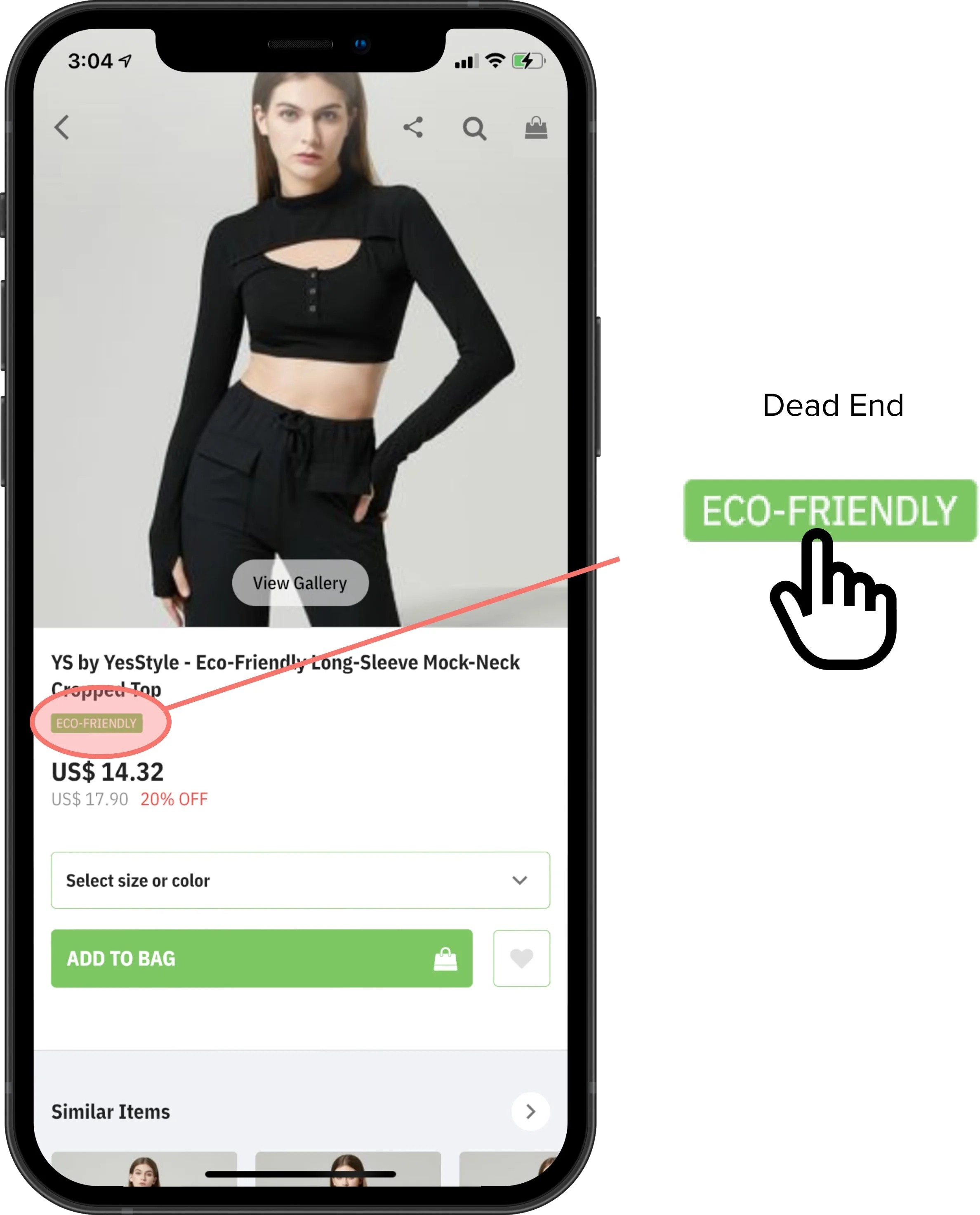
Project Yesstyle, a popular fashion e-commerce store is globally renown for selling cheap products for their low prices. For this project, we are evaluating Yesstyle’s mobile application on iOS to identity user pain points through qualitative research and improve customer experiences by redesigning portions of the app.

*I am not affiliated with Yesstyle in any form


Challenge


Yesstyle’s design for their mobile app and web site has remained very consistent for the past 5+ years. And though the design has held up well for a majority of the time due to its simplistic branding, many features on the site can be improved from a user experience standpoint. Addressing possible pain-points users may have with the Yesstyle app would increase customer satisifaction with the app, which would likely effect customer purchases.


 Research


To identify user pain-points, I brought in 3 stakeholders who were part of Yesstyle’s target demographic, young females who buy asian products at a cheaper price range. With each participant, I instructed them through a research script to complete certain tasks using Yesstyle’s mobile app. I then would follow up these tasks with questions regarding how the participants felt while accomplishing these tasks.

 
Rectangle 92.png

Issue 1

Homescreen 


Cart Placement

Participants were asked to open their shopping cart. Out of the three participants, two immediately looked towards the upper righthand corner of the screen, only to find that the shopping cart was not there. It these two participants an additional 2.3 seconds on average to find the shopping cart compared to the other participant, who found it in one second. Though it’s a small issue, relocating the cart would improve how intuitive the app is to users.


Accessibility

Throughout their home page, Yesstyle has animated countdown timers for their black friday sales. However, these countdowns are not accessible for those who are visually-impaired, considering there is no raw text for screenreaders to read.


 Redesign 1

Homescreeen


Using these insights from my research to fuel my design vision, I then made two changes to the home screen. The first being that I replaced the “Sales” section with the shopping cart to reduce user-error misclicks. Shopping carts per convention tend to be in the upper righthand corner of screens, making this a much more intuitive design. Then, I also added a countdown timer made of just raw text to go underneath the animated countdown timer, making it possible for screenreaders to properly read the timer,


Rectangle 93.png

Issue 2

Browsing


Dead Ends

While browsing through items, a participant came across an item labeled “Eco-Friendly”. She then clicked on the label, wanting to view other clothing labeled eco-friendly. However, nothing happened when she pressed the label. Instead, to find more eco-friendly clothing, she had to search “eco-friendly” into the search bar of the site, adding an extra step in the browsing process.


 Redesign 1

Homescreeen


To improve the browsing experience, I redesigned the flow of the app so that when a user would click on a item tag, all items with that tag would be displayed in a search result. This simplifies the browsing process for specific tags for consumers.


Rectangle 93.png

 Issue 3

Item View


Tedious Size and Color Selection

To select a size and color for clothing, the user must click a dropdown button that leads them to another screen. That screen lists every single combination of colors and sizes the item comes in. Therefore, items that had many different combinations required participants to tediously scroll to find their desired combination.


No Quantity Selection

Though many clothing sites do not have a feature on their site to order multiple quantities of a piece of clothing, Yesstyle should. Yesstyle sells makeup, accessories, and other items beyond clothing, increasing the likelihood that users may order multiple quantities of the same item.


Accessibility

The light green and light gray used on these screens are inaccessible for people with visual impairments who made need higher-contrast colors. These colors should be darkened to accomodate for these users.


 Redesign 3

Item View


To improve the item viewing experience, I eliminated the need for a separate screen to select sizes and colros by integrating color and size selections on the item view page. Additionally, I separated the color selection and the size selection, allowing users to select their desired color and size without scrolling through an entire list. Then, per participant feedback, I added a quantity selection in the case a customer wants to order multiples of the same item, and increased color contrast for some UI elements to make the app more accessible. To maintain accessibility, I also ensured that the selected size or color of an item would be recognizable not only by color, but by an added circle around the selection.


Rectangle 93.png

Issue 4

Saved Items


No Lists Option

Participants were asked to save items they liked. Of the three participants, one brought up that they expected a “List” option, where they would be able to save specific items to specific lists they created. Yesstyle does not offer this feature, but it would allow a better way for customers to organizer and filter their saved items.


 Redesign 4

Item View


Selecting/Creating a List

To first begin the process of saving an item to a list, the user needs an option to create or select a list when they save an item. To accomplish this, I had a partial screen slide up on top of the item view screen that would display all of the existing lists on the account.


Editing Lists

With the introduction of lists must come the option to edit them. To edit a list, all the user must do is go to the Saved Items page and click the pencil icon on the list they would like to edit, where they can edit the name of the list.


Deleting Lists

Lastly, the last function to be introduced is the option to delete a previously created list. To accomplish this, the user would click on the trash icon in the upper righthand corner of the lists screen and then press the delete button next to the list they would like to delete.


Rectangle 93.png