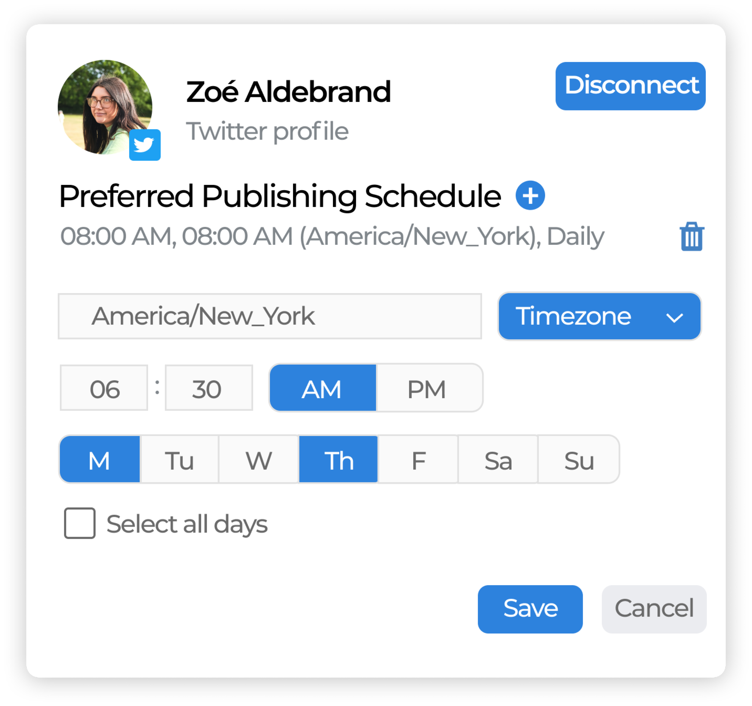
Desktop Design

OVERVIEW

Project Qnary is currently in the process of creating a new desktop portal that has improved UX and better reflects their rebranding. I designed a few dozen screens to assist with this process. This page will cover two of those screens.


Group 90.png


Group 78 (1).jpg

 Problem

Qnary is currently in the process of creating a new desktop portal for their services. With this new portal, the design team and I are tackling two major issues, updating and improving the user experience and branding elements of the new portal designs.


Group 93.jpg
 
macbook-pro-mockup-oriented-to-the-right.jpg


macbook-pro-mockup-oriented-to-the-left.jpg
Group 94 (2).jpg
 

 Research

Before I start a design task for the redesign of Qnary’s desktop portal, I always like to revisit some of my research that I’ve done on their users. Typically, Qnary’s users are 40-60-year-old working professionals who do not have a lot of experience with interacting with technology. I’ve compiled some information about their users into this persona pictured below.


User Persona.jpg


Then, I used this persona to conduct some research on how I could improve a user’s experience with technology if they were similar to the persona I created. Listed below are some of the biggest takeaways on how I could improve the UX for Qnary’s audience.


Group 95.png
 

Button Size

It’s generally recommended that when designing for stakeholders who are older that you increase the size of many elements on your designs, particularly buttons. Increasing the size makes the buttons more noticeable and easier to click.


Group 96.png
 

Symbols

Since users who are older tend to be less familiar with technology than their younger peers, they may not recognize what a symbol on a button could represent. Therefore, it’s better practice to either label your buttons purely with plain text, or to have a symbol with plain text accompanying it. However, this rule is considered a bit difficult to follow if one designing on smaller screens where larger buttons with words may be difficult to fit.


Group 97.png
 

Consistency

It’s very important that when designing for multiple screens that you maintain consistency. Maintaining consistency increases predictability, which means that users will have an easier time navigating your designs. This applies to many design elements, such as buttons, font, icons, and orientation..

 
Rectangle 20.jpg

 Design Process

As a Freelance Designer for Qnary, I often have a design to work off of that Qnary’s design team already created. In this case, I was given a few screenshots of the first few screens that were already designed for the new portal. This meant that when I was designed new screens or elements, I would have those screenshots to reference as a style guide to help maintain consistency.


mockup.png
 
Group 99.png


Preferred Publishing Schedule

One of my more recent tasks was to replicate a feature called “Preferred Publishing Schedule” that’s available on Qnary’s current platform. This feature allows a log of client-approved content recommended by a user’s Qnary Digital Strategist to be posted on a users’ social media account at specific times. I was assigned the task of replicating and improving this feature in the new portal. So first, I looked at the current portal to see exactly how the feature originally operated and what user inputs it needed.


Preferred.JPG


Then, I spoke to my supervisor who told me additional details on what new requirements the feature needed to meet. This left me with a comprehensive list of needs that I had to design for.

  • A way to add multiple preferred times

  • A way to delete preferred times

  • A way to select specific times

  • A way to type and select the time zone

  • A way to select specific days of the week

  • 2 layout options

Additionally, there were a few changes that I wanted to incorporate as well. For example, in the current portal, I saw that it’s a bit difficult to read previously set preferred times because the scheduled times weren’t in plain text, they were being displayed through a dropdown menu that was editable at any time. So, I knew that I had to create a way to let the users have a “viewing mode” to just see the scheduled times in plain text and an “editing mode” where they could change scheduled times. To demonstrate this, I made a user flow that would apply to both designs I made.


Group 101.jpg


Option One


149969151_470818944094494_3671744807942976724_n-removebg-preview.png
 
Option 1 Frame 2 1.png


Time Zone Dropdown

In this version, the user can select a time zone by using a time zone dropdown menu. A dropdown in this case is suitable because Qnary only supports three time zones currently, so there would be no excess scrolling. Another benefit is that if Qnary decides to add more time zones later on, it’ll be easy to implement since it will just be added onto the dropdown list.

Time Selection Typable

To choose a specific time for content to be posted, the user would type in a time split between two boxes, one for the hour, and one for the minutes. This is a quick and easy way for users to type in times and requires no scroll feature.

Days of the Week Radio Buttons

The user can choose multiple days for content to be posted by using radio buttons. Having the days formatted this way allows the user to easily see at a glimpse which days they have selected for content to be posted. There’s also a “Select All Days” checkbox underneath the buttons to make it easier if the user wants content to be posted on a daily basis.


Option Two


149959693_1105232226569993_4081932483988039503_n-removebg-preview.png
 
Group 102.png


Time Zone Radio Buttons

Unlike in option one, option two lets the user choose a time zone through radio buttons. Displaying the time zones like this allow users to easily see what time zones are available at a quick glimpse and follows the time zone selecting conventions that were present in the current portal.

Time Selection Dropdown

In option two you can select the time for content to be posted by using a dropdown menu for the hours and the minutes. This allows the user to select a time without typing and a dropdown for selecting time follows the conventions that were present for time selection in the current portal.

Days of the Week Dropdown

Rather than using radio buttons for selecting a day of the week like in option one, option two allows the users to select multiple days of the week from a dropdown menu. This helps the screen look less cluttered.


Comparison Chart

Since I provided Qnary two design options to choose from, I often like to include a comparison chart so my clients can easily see the differences between the designs that I described earlier.


Group 103 (1).png


Add/Delete Users

Another feature I was asked to design for that the new portal did not have yet was the ability to add and delete users. Below is a screen of the current portal that has those functions.


Qnary remove.JPG


Unlike the the preferred publishing schedule task I detailed above, this task had very few requirements since my supervisor really wanted me to explore the design options. The only requirement she had was that I create three options for the design team to choose from when I designed a way for users to be deleted.

Add a User

In the current portal, when you click the “Add User” button, a pop up appears asking you to put in some information about the user. I decided to follow this format because it follows the current portal’s conventions and the form to add a user isn’t long enough to warrant a separate screen. So when designing the pop up, most of my attention was devoted to following the styling conventions already present on the new portal.


Group 104.jpg


Delete a User

After designing the “Add a User” feature, I began to work on the feature will let users delete users. There were three ways I designed for this feature to work so that the design team could pick which method worked best for their users.

Option One

Option one allows users to delete users from the portal using a batch removal system. In order to delete a user, the user would select which users they wanted to delete and then press the delete button. I think having the ability to delete multiple users at once will be extremely valuable for Qnary and prevents the tedious process of removing multiple users one by one like users had to do on the current portal.


Option 4.jpg


Option Two

For option two I designed the deleting feature practically the same as the current portal had it. In this option, users can only delete users individually. This option is best if a stakeholder is looking for a single profile to delete because unlike option one, the user would not have to scroll to the top of the page in order to press the button to delete selected users. Additionally, this option requires the smallest amount of formatting changes to the new portal, making this the easier option for the web development team.


Option+5.jpg


Option Three

Lastly, option three gives the best of both worlds. Users will be able to delete users in batches or individually.


Option 6.jpg


Comparison Chart

And here is the comparison chart comparing how each user’s card will look depending on which option is chosen.


Group 105.png
 

Results


Here are the final screens for Qnary’s new portal. Additionally, I’ve included some other designs that I’ve made for Qnary that I didn’t get a chance to talk about on this page.


Qnary Transparent Logo Without Words.png
 
Group 76 (1).jpg