Maintenance Scheduling


Overview

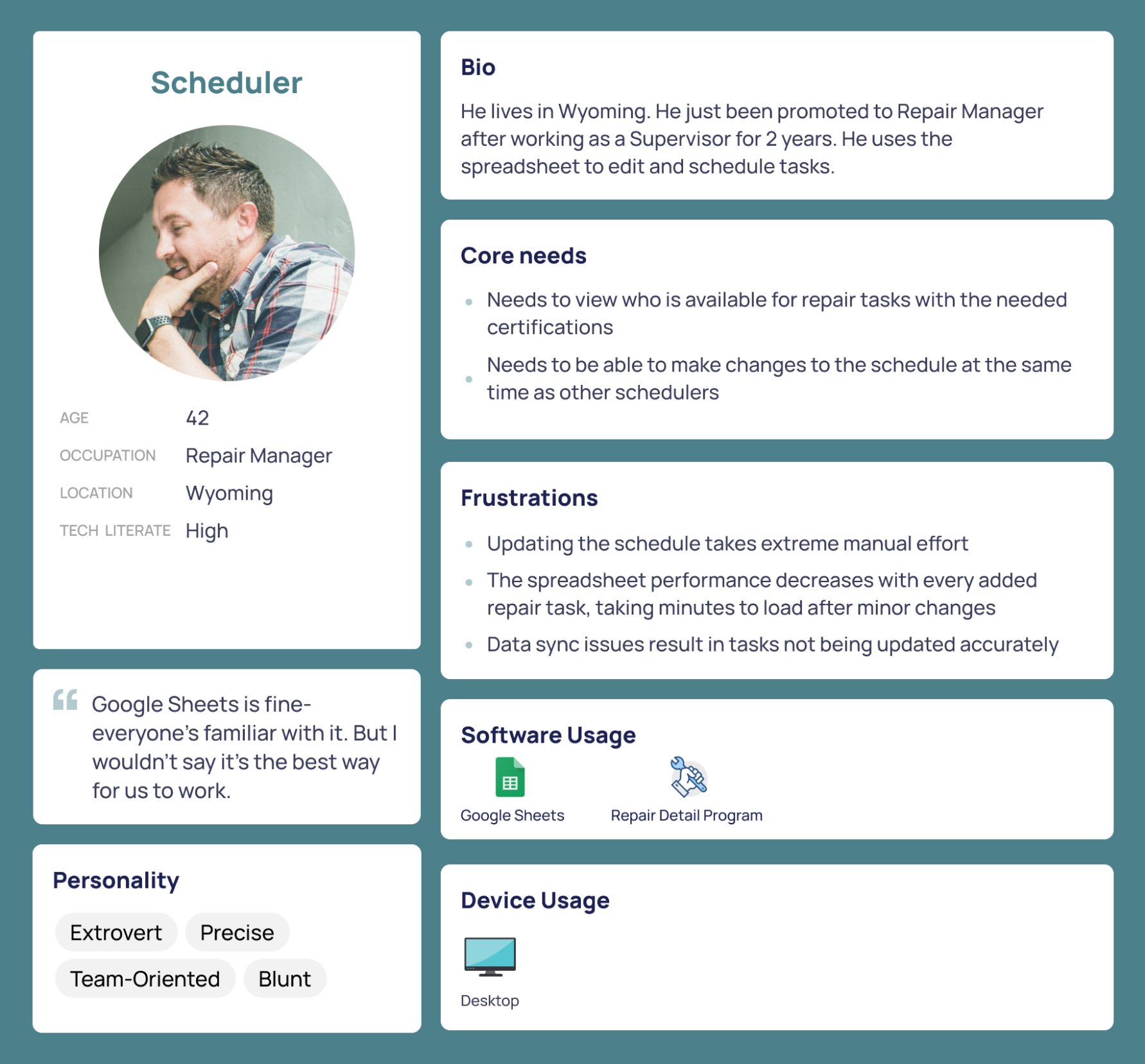
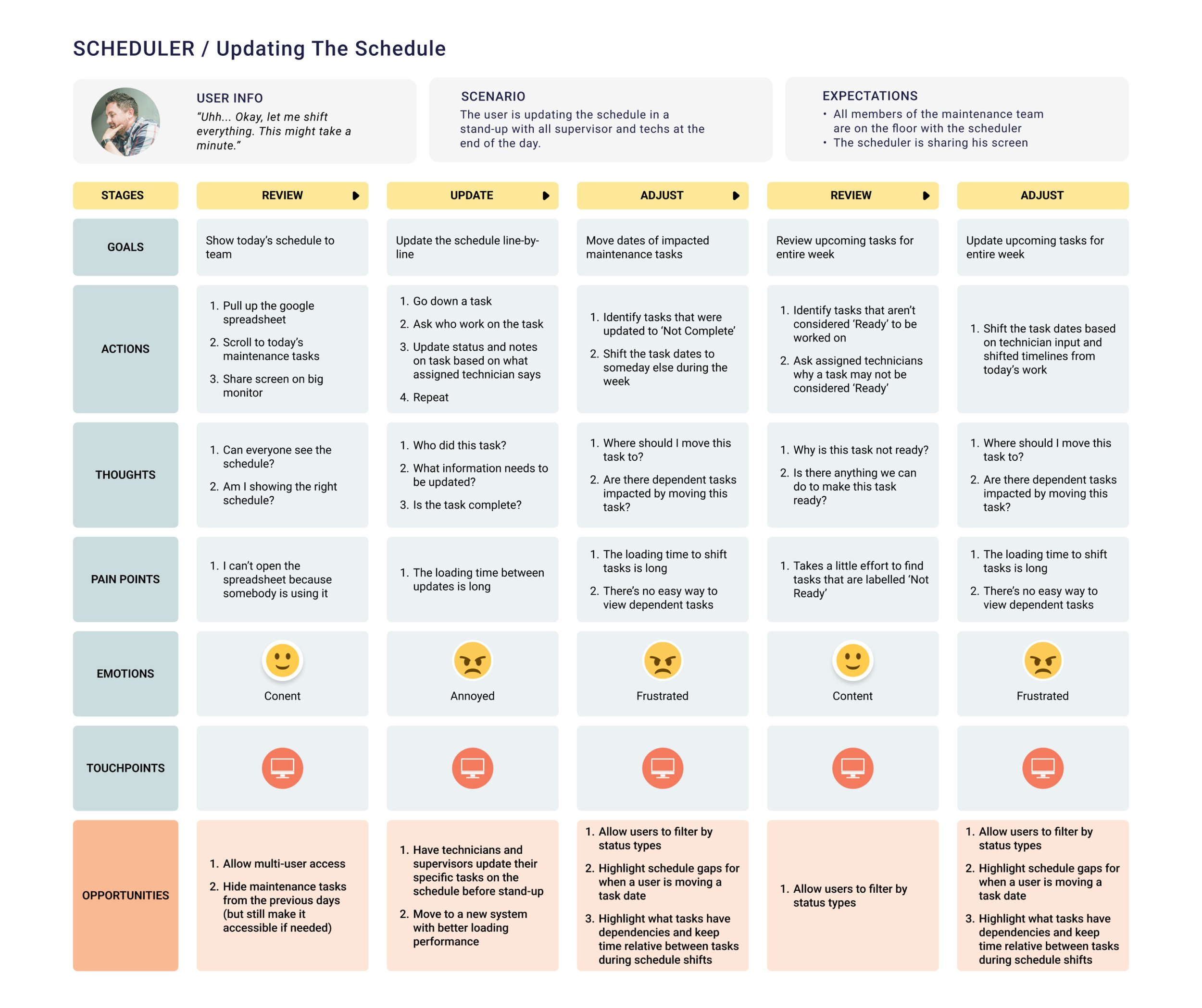
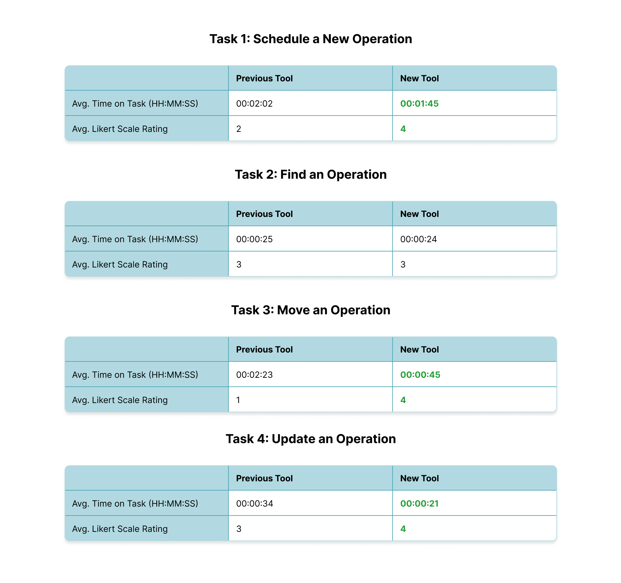
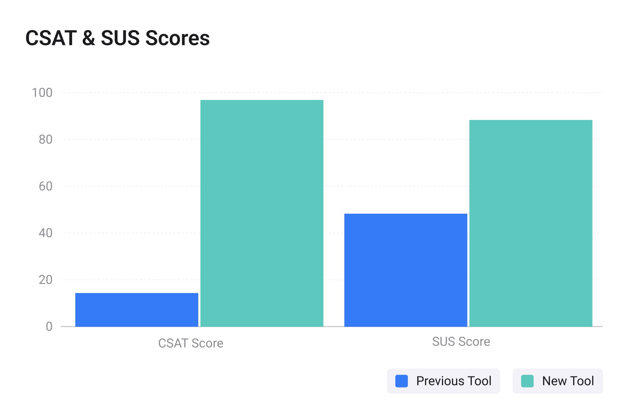
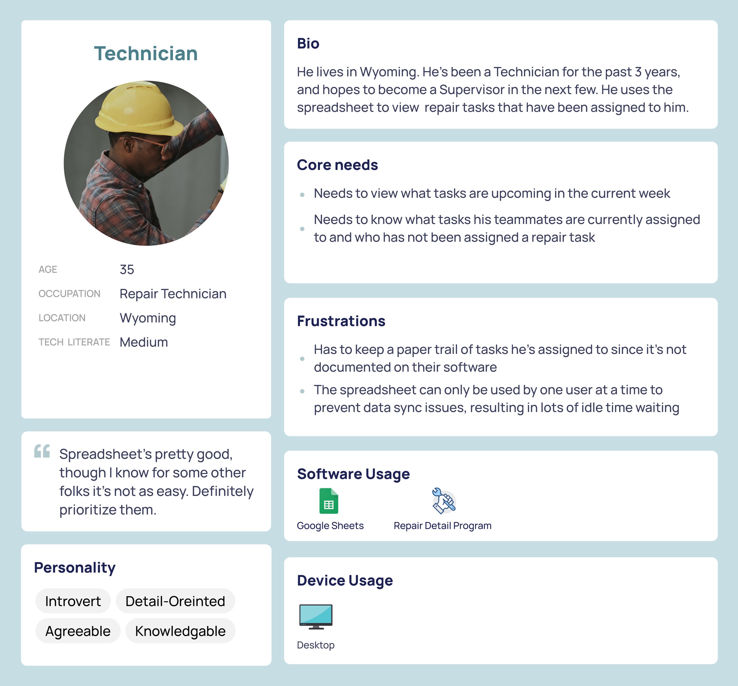
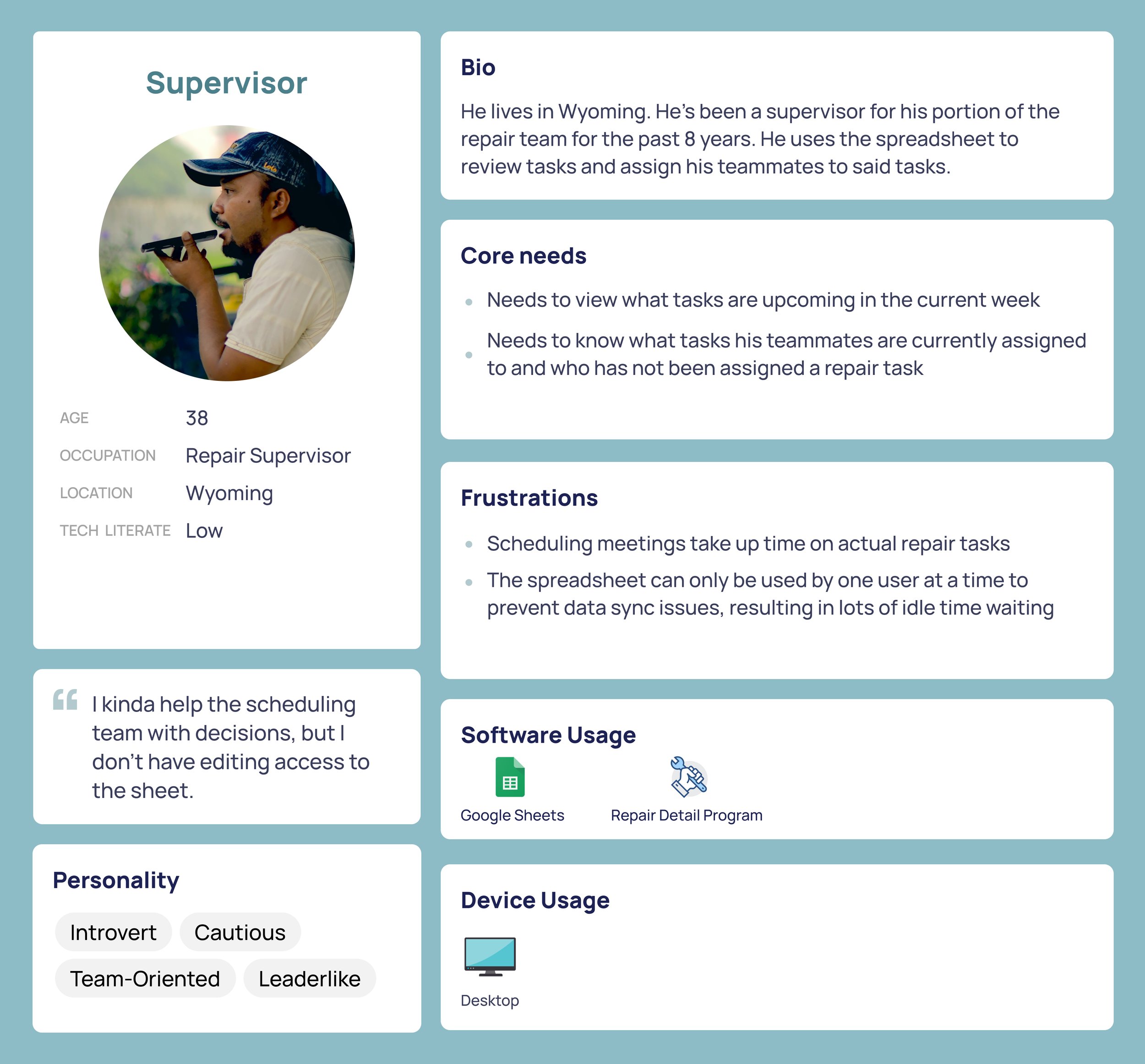
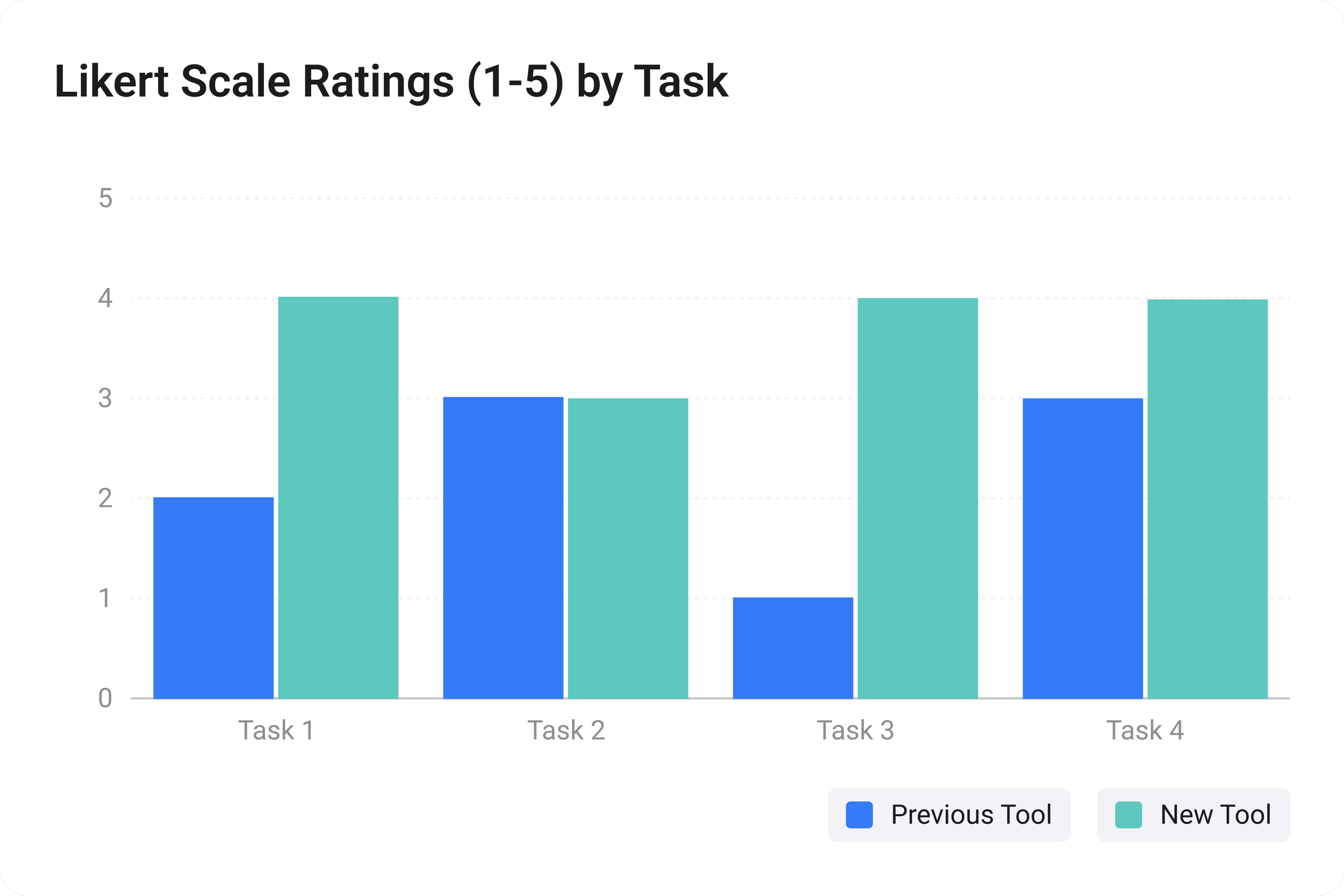
Project In manufacturing, maintenance is key for reusable and lucrative operations. However, scheduling maintenance and repairs can be difficult in some industries where maintenance tasks can take days or months, and can be unprecedented at a large scale. This project covers discovery research about existing scheduling systems for an auto repair company and benchmarking new scheduling systems to determine their impact.

Note: Some information may be generalized, changed, or redacted for nondisclosure agreements.


image 3 (1).jpg

Challenge

To ensure smooth operations and optimize resource usage, scheduling maintenance for vehicles is essential. However, based on produced metrics and passing concerned statements from the maintenance team, my UX & production team and I hypothesized that the software tools used for maintenance scheduling negatively impacted the scheduler’s abilities to plan maintenance ahead of time. Deadlines for repairs were repeatedly being missed and pushed, making dates unreliable and negatively impacting customer relationships with the company.


Research Process


Rectangle 99.png
 

Discovery


INTERVIEWS

There were three goals for my interviews: To understand how scheduling is done currently, what the existing pain points are within scheduling, and if these pain points are contributing to missing delivery dates.

These interviews were conducted remotely on a call following a semi-structured format outlined in a script with generative and probing questions.

ex. “How do you know when something needs to be scheduled?”


**Note: Due to the legal obligations, I cannot share images of this specific project. These images are not from this project but represent the processes I went through.

ANALYSIS

After these interviews were conducted, I hastily began to analyze the contents of the interviews to identify trends and themes in the qualitative data. These themes were broken out into ‘Current process’, ‘Pain Points’, and ‘Ideal vision’ to help the design and development team better understand the users. Through these themes, I was able to communicate what the current state is, what short-term quality-of-life improvements could be made, and what the long-term vision of the improved scheduling tool could be. 


Analysis was done through Figma, placing verbatim quotes from users, marking the number of times a similar sentiment was shared across the other users, and pain points were ranked on a 1-5 Likert scale to determine the severity of the pain point, determined by the user in relation to work stoppage. 1, representing the pain point completely stalls work, 5, being that the pain point doesn’t halt work progress.


FINDINGS


Group 176.jpg
 

SHAREOUT DELIVERABLES


In addition to my general findings, I produced a powerpoint presentation for a deeper delve into the findings, persona cards, and a user flow diagram to communicate the current state of scheduling and opportunities for improvement. All developers, designers, and product owners were invited, creating an open forum for questions to elaborate on my research further. 

In order to consider and appeal to my audience further, I decided to change how I structured my personas and journey maps. Rather than using fictionalized names to represent my deliverables, l grouped the deliverables by the ‘type’ of user they are, based on their interactions with the schedule. By labelling the deliverables in terms of “Schedulers”, “Supervisors”, and ‘Technicians”, it allows us to consider all use cases.

Schedulers are our “power users”, actually using and editing the schedule. Supervisors and techs reference the schedule.

**Note: The following are generalized replicas of the personas and user flows created due to legal obligations.


Rectangle 99.png
 

Discovery


After presenting my findings, along with my persona user information and my journey maps documenting the painful process of using Google Sheets for the maintenance team’s scheduling, I was then tasked with providing the design team research that would help evaluate impact of a new tool they were planning to create for the maintenance team utilizing the discovery work I completed earlier.


These benchmarking metrics were collected before the spreadsheets were retired, and 1 month after the new tool was released.


LAB STUDY - QUANTITATIVE/QUALITATIVE METRICS

To provide an evaluation of impact- I decided to utilize metrics, primarily metrics on time and daily maintenance goals met, to provide an unbiased and quantitative view of the changes that would exist between the tools in the future.

In a lab study, I would bring in users and assign them specific tasks that they do in their day-to-day work with the schedule based upon their persona role. Ex. Please move this operation a day forward.


I also included a CSAT and SUS scale to incorporate product and usability measurements that upper leadership, who just want one comprehensive number, could utilize and view at a quick glimpse.


**Note: Due to the legal obligations, I cannot share images of this specific project. These images are not from this project but represent the processes I went through.

ETHNOGRAPHIC STUDY - QUALITATIVE/QUANTITATIVE METRICS

In addition to a lab study, there were some metrics that had to be gathered in an environment where technicians, supervisors, and schedulers, could freely interact. For example, one task that was measured, which was updating a single task on the spreadsheet- requires lots of back and forth verbal communication that can not be replicated in a lab setting.


Therefore, I attended these stand-up meetings online and acted as a fly on the wall, recording metrics and comments.


EVALUATING IMPACT


After all benchmarking data was collected, I created a presentation that compared each of the metrics collected between the spreadsheet and the new tool, from a task, and then product-level. Task level metrics help determine if there’s a specific task/area/feature set that might need more UX support if there was no evaluated positive impact, while product-level metrics help determine if the new tool has improved scheduling and the experiences of users holistically. This could also determine relations between improved task scores with product scores.


TASK-LEVEL METRICS


PRODUCT-LEVEL METRICS


USER FEEDBACK


Noting the positive growth in product and task level metrics, we also wanted to consider qualitative aspect of things, to get more opinions directly form our users on the new scheduling tool. Through this, we were able to get a holistic view of usability and satisfaction with the new scheduling tool, which is considered to outperform the previous tool from users.


Rectangle 102.png